Many desktop system operators have had such troubles that when the color image is processed by a computer, the color effect consistent with the display cannot be obtained when outputting or printing. This is due to the difference in the color rendering mechanism between the screen color and the process color. The color of the screen is displayed by phosphor layers with different intensities of electrons on the phosphor screen, and the printing colors are overprinted with four-color inks, and the color gamut of the screen color is larger than the printing color gamut.
In addition, there are color casts on each screen, some may be reddish, and others may be bluish. In most cases, the screen printed with white is 25% blue, and the screen will be aged and discolored over time. Strictly speaking, each part of the screen presents different colors. It can be seen that normal computer screens do not have correct color correction and it is difficult to obtain correct colors.
For these reasons, the designer cannot directly use the color of the image on the screen as a standard for proofing or printing, but must adjust the screen to make the color of the screen as close to the color as possible.
Take Photoshop image processing software as an example here to give the basic steps of screen color adjustment:
(1) First, make sure the screen is turned on for at least 30 minutes so as to ensure the stability of the screen image.
(2) The lighting of the studio should be controlled at the standard color temperature. It is best to approach the 5500 K daylight color temperature. All the light sources for viewing and reading the sample must use the same light source, because the same color sample is viewed at different color temperatures. It will be different. Then adjust the contrast and height of the screen while preventing outdoor light from entering the room.
(3) Basic parameter setting of the monitor: Select File → Color Settings → Monitor Setup to open the “Monitor Setup†control panel for parameter setting. as shown in picture 2.
• Monitor: Select the model of monitor you are using from the drop-down menu.
Gamma value: All screens have a default gamma value, which indicates the contrast of the image color. When the value is large, the contrast is large, and the value of hourly contrast is small. The default value under Windows is 1.8, and the default under Mac OS is 2.2.
• White Point: This parameter is the value of the brightest part of the screen in color temperature. The screen is blue when the color temperature is high, and it is yellowish red when the color temperature is low. Generally set the color temperature to 6 500 K, close to the daylight color temperature, to meet the needs of print.
Phosphors: Select the phosphor type used by the monitor.
Ambient Light: This parameter is determined based on the ambient light intensity in the operating room. There are three options: strong, medium, and low. When the light is strong, the image will be bright. When the light is weak, the image will be dark.
• After the settings are completed, press OK to confirm or press Save to save the settings.
(4) Prepare a color sample for further screen adjustments. Here, the screen is adjusted using the color samples included in Photoshop. In Photoshop, there is a CMYK Table.TIFF image. The image is a CMYK mode level. Open the File→Printing Ink Setup and Separation Setup control panel (as shown in Figure 3 and Figure 4) and specify the type of ink used. According to the printing method and the printing conditions, the dot gain value, GCR and UCR, the black volume, and the total ink amount are set. After the setting is completed, this image is output as a standard proof.
(5) Further adjust the screen according to the sample draft. This step only changes the color of the image without changing the image data. Keep the CMYK Table.TIFF image open so that it compares to the proof at any time. Open the Calibrate control panel under Monitor Setup (as shown in Figure 5) and adjust the gamma value until the color on the screen is basically the same as the proof.
(6) Pick up a piece of printing white paper, press the White Pt, and click on the triangular piece to try to match the white point of the screen with the white paper. Press Black Pt to adjust the black point.
(7) Use the Balance option to adjust the hue, move the triangle blocks below the R, G, and B respectively, and constantly compare the sample drafts with the sample images on the screen to make the hue of the two similar.
(8) Use the preview function to observe the adjusted effect. If there is no problem, store the above settings for future use.
Monitor Correction Considerations
1. Adjust the monitor regularly. The display will gradually age over time, not only will the color temperature change, but also the red, green, and blue phosphors will age at different rates over time, causing chromatic aberration. Therefore, it is necessary to make regular adjustments to the sample drafts.
2. When the copy conditions change, the monitor needs to be recalibrated. If you use different inks or papers for copying, or if the used software, hardware, and ambient light sources change, you will need to recalibrate the screen.
3. Keep the standard proofs properly, and if they are discolored, they should be promptly replaced; the image files of the standard proofs should be kept permanently so that they can be used directly when the proofs fade.
4. After the adjustment is complete, do not change the display settings arbitrarily due to personal preferences. After the adjustment is completed, the display adjustment button can be sealed.
5. In the entire desktop publishing system, all screen corrections must use the same proof sheet to ensure that the system can calibrate the monitor's contrast and brightness, gamma, color balance, and white field using Adobe gamma utility to eliminate monitor display. The color cast of the time makes the gray of the display as neutral as possible.
Monitors As CDTP soft proofing devices and monitors, people always hope that the screen display can be consistent with the printing results. However, due to the screen's color difference, different color rendering methods, and restrictions on printing conditions, the display effect and the original are often There is a big difference between prints. When we use the above methods to adjust the display, we can ensure the correct reproduction of the screen colors and achieve a true meaning of WYSIWYG.
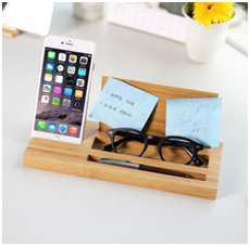
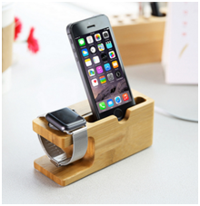
Unique smart watch and smart phone charger stand, large space,Slope surface, Comfortable fabric backrest,Does not Tip-Over when placing or pressing the phone.Bamboo Wood stand is as solid build for better stabilization and a natural look for a classy Chic home or office.A great place to keep your smart watch and smart Phone clean and safe at night while charging
Description of multifunction holder
Material : bamboo
Size : customized
Color : natural wood
Feature : Eco-friendly
MOQ : 500pcs
Payment terms : paypal,T/T,western union
Packaging : 1pcs/box
Delivery : 10-30days


FAQ :
Q : Can you engrave LOGO on the product?
A : Yes,we can
Q : Which payment method do you use ?
A : paypal,T/T,Western union
Q : Is it available to get samples before ordering?
A : Yes,of course
Multifunction Holder
Multifunction Holder,Wooden Table Organizer,Custom Desk Organizer,Multifunctional Phone Holder
Jilin Province HZD Trade Co., Ltd , http://www.jlhzd.com