When the sign assumes the responsibility of conveying information
Experts attending the Packaging World Roundtable believe that in today's turbulent retail environment, signage can be an important method for effectively communicating information. In the recent sales strategy to promote closer links with shoppers, there are two kinds of recently-listed product packaging that use the logo as the main graphic.
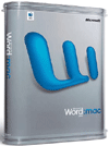
Microsoft Office: The main pattern of Mac software packaging is a logo, and the shape of the plastic box also increases the shelf impact.
Attractive for avant-garde users
Apple Computer users are full of fanatics, they are avant-garde computer users. Microsoft Computer Corporation must also use the Apple version of the Microsoft Office:Mac office system to attract this group. It ported most of the features of the Office system for Windows to the Office:Mac system that was used on Apple computers.
When selling computer software to users of Apple Computer, Microsoft is only one of several hundred third-party software vendors. It must be able to attract most of Apple's fanatic users. The packaging of the product must be able to highlight itself in chaotic shopping mall shelves and attract potential consumers.
Packaging Tips: Famous Landor Associates Consulting and Design Company for Apple Edition
Microsoft Office: The Mac office system has designed a brand-new packaging, which uses a combination of structure and graphics to show a unique appeal.
There is a logo on the front panel of each package that represents the software version. If a characterization "W" stands for Microsoft Word, a characterization "X" stands for Excel. A color coding system clearly shows the difference between each version.
This design "doesn't need to say anything more to Apple Computer users," explains Tan Le of Landor Associates. "The audience is very focused and there is nothing superfluous in this design."
However, this design must also highlight Microsoft's brand in order to be recognized in the market. The logo on the package helps to demonstrate its connection with Microsoft. According to Le's explanation, the design adopted this mark was developed from an earlier version of the software, which establishes a connection with the previous version.
The new packaging is a round-edged box that is thermoformed from PET plastic. Shapes are increasingly used to differentiate brands, and thermoforming methods allow the package to have a unique shape that stands out on the shelf.
It is like a clam shell. The two halves of the foldable shell together form a complete package. Two thermoformed PET caps are used to lock the two ends to form the two end faces of the package. The internal PET lock catches the software disc.
Because the packaging is sold worldwide, the packaging engineering and management department of Microsoft Corp. and Landor have worked together to find three suppliers located in different countries to meet the production needs of this packaging.
In this plastic container, there is also a paper sleeve with a striking pattern printed on it. Because different software versions have different sets of paper, the patterns will also differ depending on the software version. Basically, these patterns are printed with a four-color offset and, if desired, spot colors are also used.
Mercury recognizes the logo as a way to express a sporty beverage.
Not just "another sports drink"
In the beverage market, there are as many as hundreds of sports drinks alone. The Mercury Group in Connity State also launched Mercury-branded drinks to join in this campaign of sports drinks, which required a different approach to positioning itself.
Packaging Tips: The company's approach is to use both powerful graphics and innovative packaging shapes.
From a pattern point of view, the company chose the image of Mercury God, who represents speed in Roman mythology. This is the main sign on the beverage bottle and an important part of the company’s overall market strategy.
“We need to create a brand new, distinctive product in the beverage industry,†said Billy Bishop of the Mercury Group. “This logo creates a mystery behind the brand. And, as part of the brand, it’s It's also a unique sign that people feel is very reliable. We can print it on a cycling jersey or other promotional items. When your budget is relatively limited, it is very important."
Bishop should know how to develop a beverage brand. Previously as a member of the marketing department of South Beach Beverage Company, he helped the company popularize the SoBe brand and gain recognition throughout the country. Later, the company was acquired by PepsiCo. The Mercury brand first entered Arizona and then expanded to Portland, North Carolina and Mississippi.
From a technical point of view, the Mercury Group also needs to maintain freshness on plastic bottles. It chose Graham Packaging's Monosorb bottle to get the shelf life needed for this product. This injection stretch blow molded PET bottle contains an oxygen absorber, which helps increase the shelf life of the product.
Another technical advantage is the use of oriented PP labels instead of glued paper labels. "Sometimes beverage bottles are placed in freezers, and the labels on the bottles need to withstand such an environment," said Bishop. The label was processed by Hammer Printing Company using a film supplied by ExxonMobil Chemical Company.