More than 80% of the color of the package comes from vision. If the designer's grasp and use of the color of the package can directly reflect a certain characteristic of the inner item, the product is likely to become the buyer's product. According to the inherent color of the product or the attributes of the product, the use of visual color is an important means of design color. For food packaging such as cake snacks, yellow, tea, coffee, whiskey, beer and other beverages are mostly brown, and the lemon shampoo packaging in cosmetics is designed as lemon yellow. The use of the color of the product itself to reproduce the color of the package is an association that gives the human beings a homologous association of objects and thus has a basic concept of the inner object.
Of course, there are also phenomena that go against the other way. Some design masters boldly use color contrast to achieve better and more strange effects, but if the level of control is not good, it will be counterproductive.
The combination of the pattern of the packaging should be considered from three aspects: one is the way of organization; the other is the theme of expression; the third is the style of display. In terms of organization, more geometric composition, abstract composition, and concrete or material composition are used. Currently, those who use geometric or abstract composition are mostly cosmetics or daily necessities. Structured or materialized structures are popular in food packaging. Some simply open a window in the package, or use a transparent plastic bag to directly see the inner items. In the expression theme, although the way of expression is different, the purpose is very clear. In the form of combination, some are mainly prominent characters, some are mainly physical objects, and some are both. Regardless of the form, it must be linked to the intrinsic item to show the clarity of the subject. In the theme expression, we should also pay attention to the simple and simple, whether it is text or graphics, and strive to achieve a single pattern, the theme is prominent, simple and clear.
The connotation of packaging is mainly reflected in the appeal of packaging, the fun of the picture, and the organic combination of product image and corporate culture. In addition, the exquisite packaging is also an indispensable factor for good packaging, including: first, the exquisite color, second, the exquisite design, and the third is the exquisite packaging, the three are indispensable.
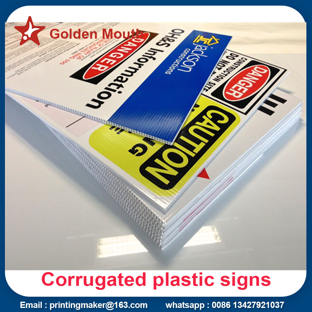
Corrugated plastic sign board its alternative name is Correx Sign Boards or Corflute Board Printing.The obvious feature of corrugated boards are made of two sheets of plastic held together with hollow plastic tubes

Feature :
- 5mm custom printed corrugated plastic board signs
- 850g per square meter corrugated board in stock (no MOQ),or other higher quality ,it needs MOQ : 5000 pcs
- printing option : uv flatbed printing diretly on the board ,digital printing on the sticker
- durable
- light weight
- cheap shipping cost
- usage : outdoor & indoor display board signs
- double sided printing optional
Artwork Details :
- Submit in CMYK color code
- Email us your Pantone for best results in color matching
- resolution should be 150 dpi or higher at full size
- convert all fonts to outline
- embed all images in final documents
Corrugated Plastic Sign Boards,Corrugated Plastic Sheets,Corrugated Plastic Signs
Golden Mouth Advertising (H.K)Co.,Ltd. ( Jie Da Advertisement Co.,Ltd) , https://www.advertisingflagbanners.com